Charlene's Personal Portfolio
Hi and welcome! I’m a design student in the Global Business and Digital Arts program at the University of Waterloo, passionate about developing my skills in graphic design, UX/UI, branding, and other creative disciplines.
Contact Me
Rebrand Project
2025
5 weeks
Figma, Adobe Illustrator, Adobe Photoshop, Adobe Firefly, Adobe Express, Adobe Premiere Pro, Procreate
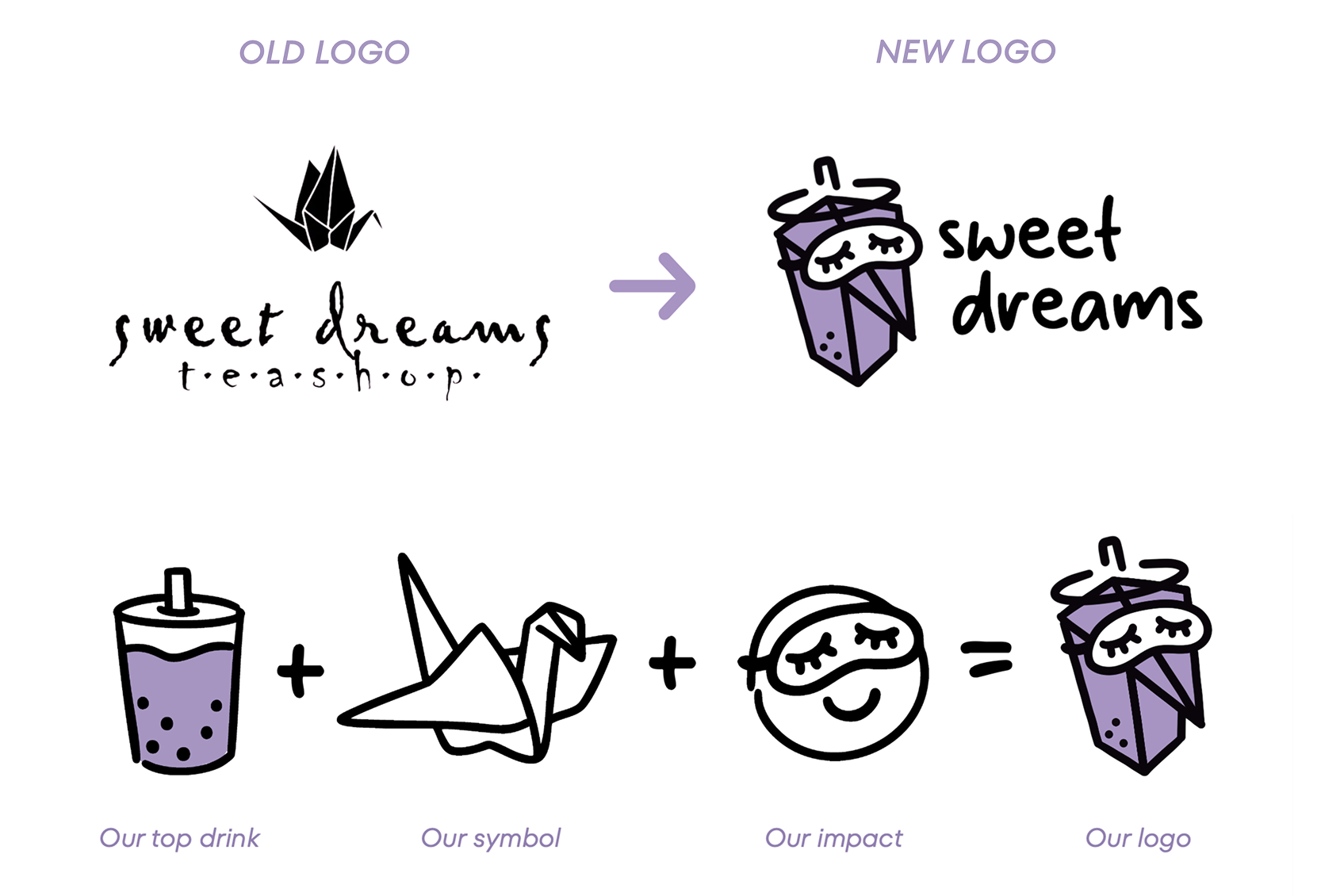
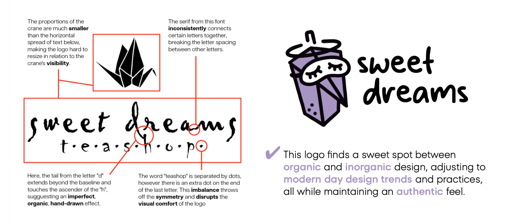
The first week of this project was spent on unpacking the brand, where I made an in-depth assessment and critique of the current brand. By analyzing and comparing their social media marketing, competitors, in store environment, and product offerings, I was able to gain valuable insights that contributed to the new visual identity.
In the second and third week I created a full branding strategy pitch where I designed their new logo, and strategized their new marketing approach with fresh taglines, social campaign strategies, packaing, product mockups, and merchandise.
In the final fourth and fifth week of this project, I created the marketing campaign package where I filmed and edited three videos advertising the rebranded products. By creating content in the form of a reel, youtube video, and product shot, I was able to touch on different media formats and create advertisements for different audiences.
Branchout
2025
8 hours
Figma
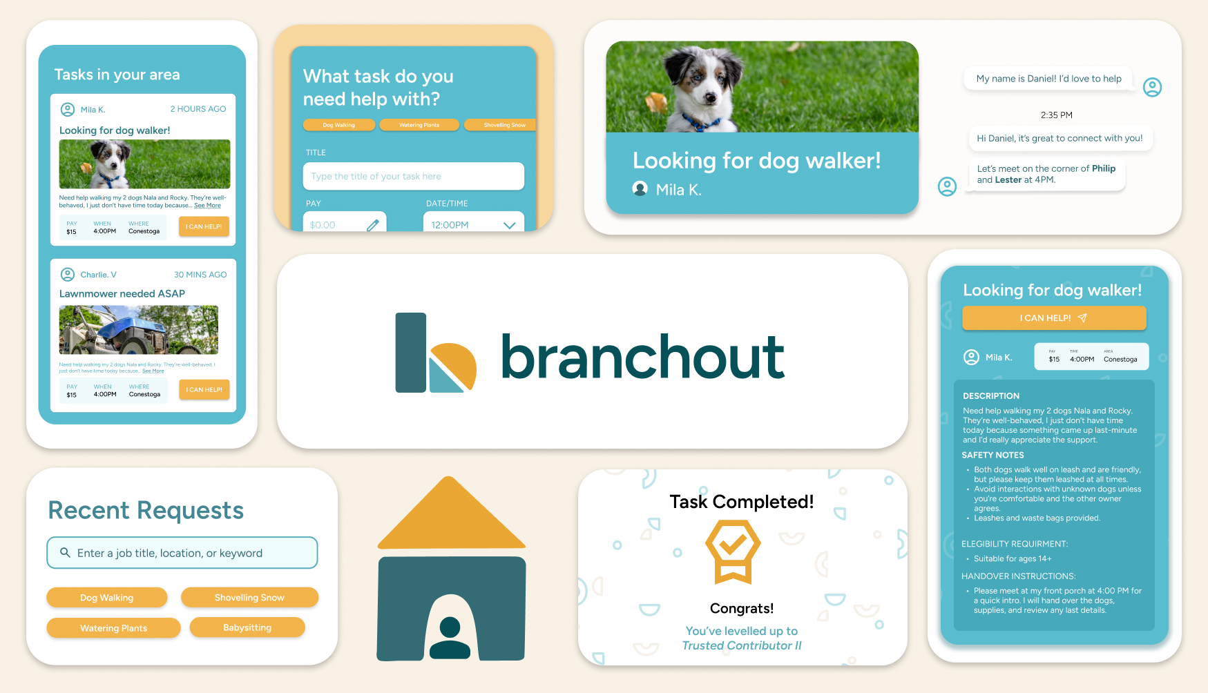
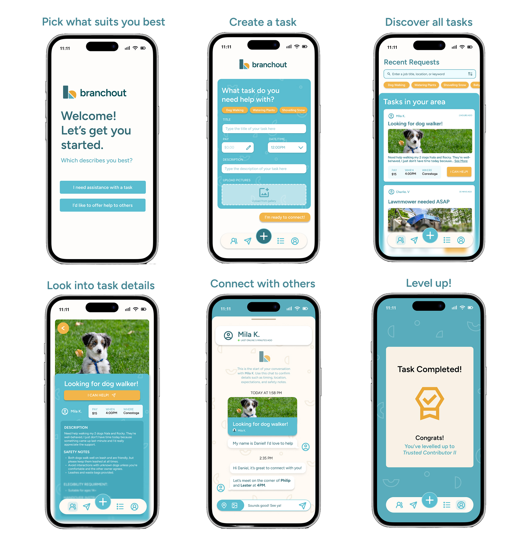
The prompt we were given during this designathon was "How might we design solutions that help people connect, care, and thrive, empowering both the individual and the community?" We decided to address this issue in partnership with World Vision, creating a solution that helps empower and prepare youth for the workforce by firstly expanding their skills through small tasks. With Branchout, homeowners in the neighbourhood can submit a task they need completed but can't do themselves to our platform. Something as simple as light yard work, shoveling snow, and walking a dog, grocery assistance, or moving furniture.
For the youth, helping homeowners with these tasks would enable them to recieve hands on experience, while homeowners receive help with the daily tasks they cannot attend to, empowering both groups to help and connect with each other. Through this app, the youth are able to visualize their progress and validate creditability, creating a solution that builds confidence while opening doors to new opportunities. Here are some of the prototypes our team made, demonstrating a clean, clear interface that is both user friendly and visually memorable.
Hack404
2025
3 months
Figma
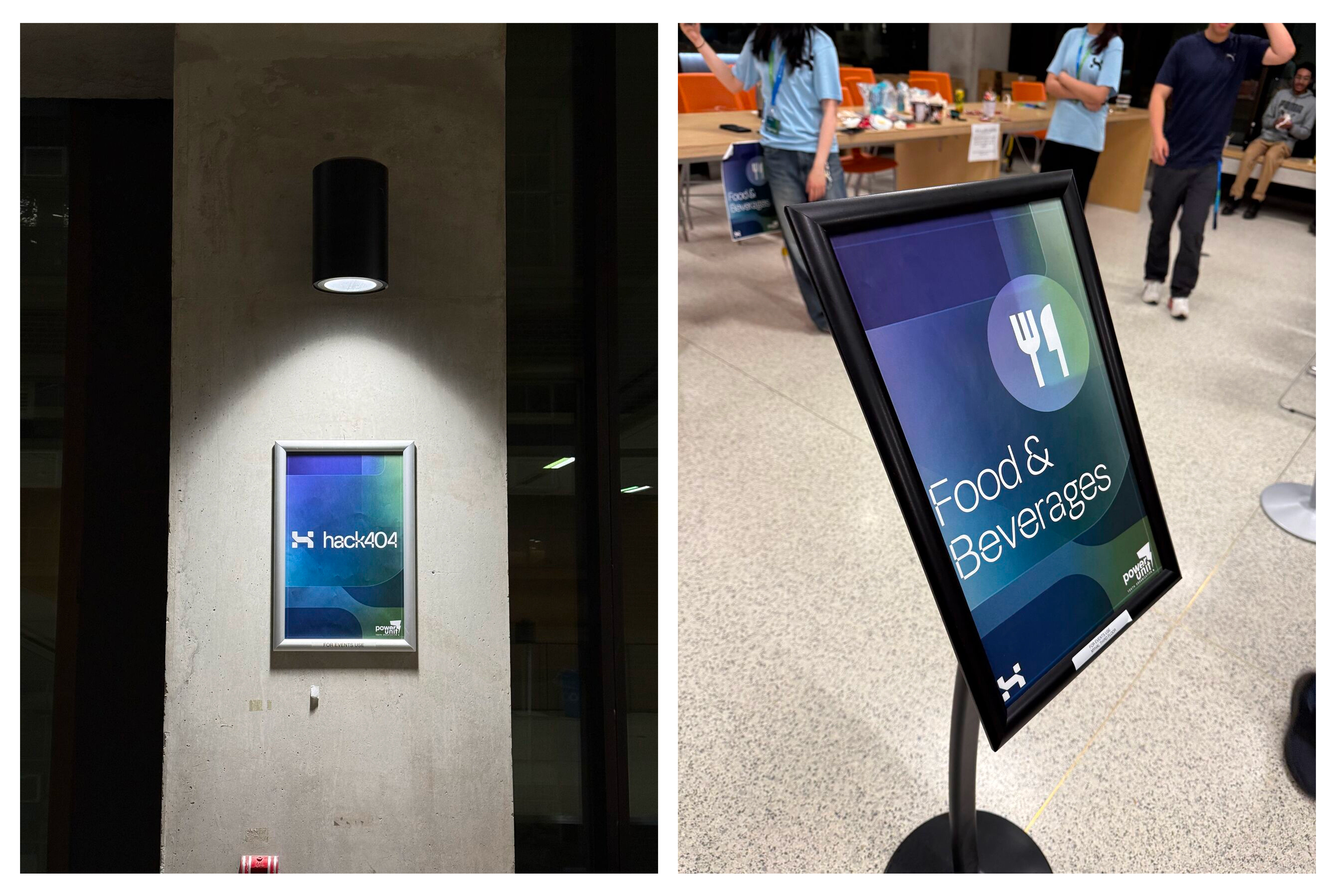
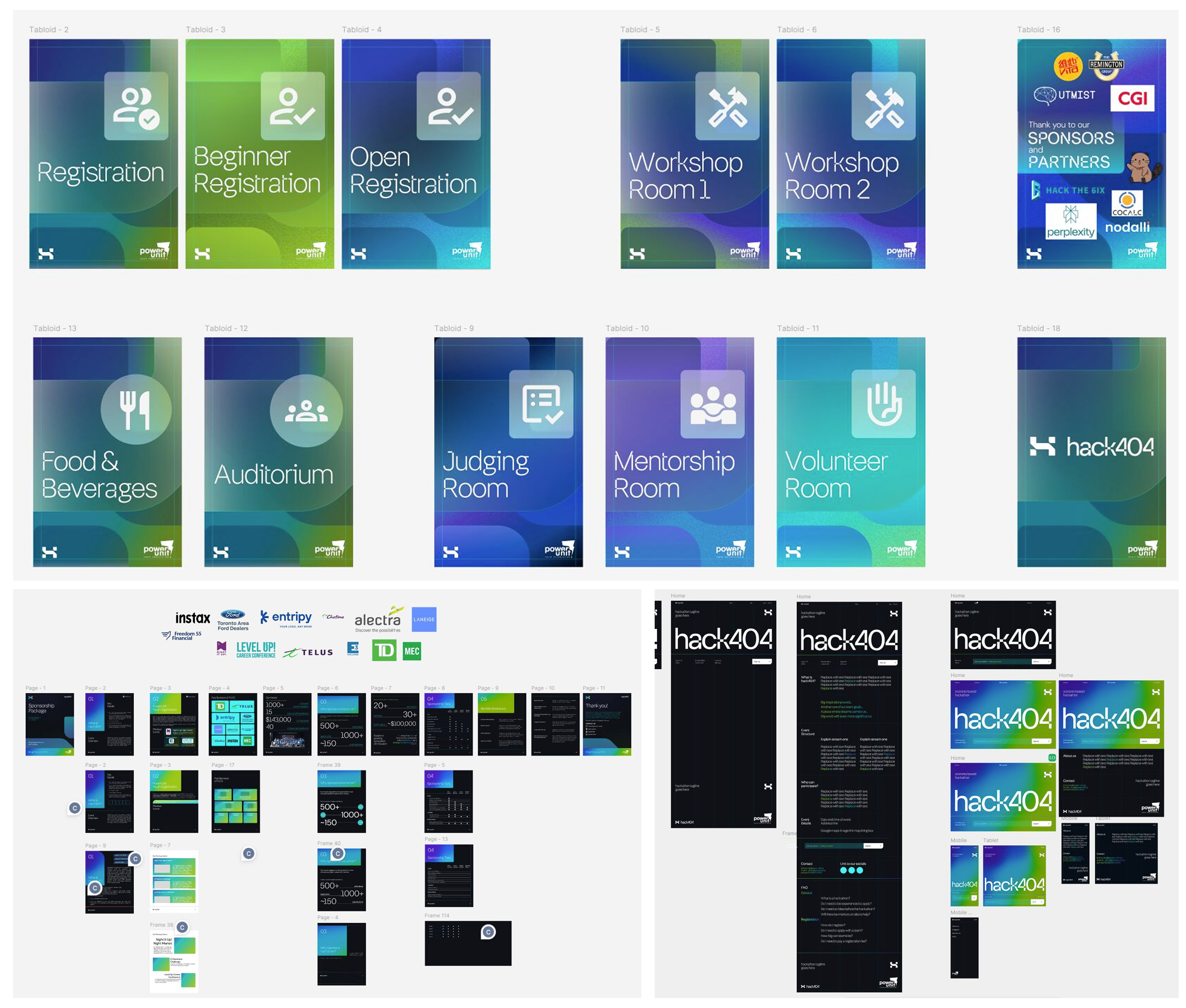
My journey with Hack404 started from designing the first iterations of the website and Instagram posts. Then in the blink of an eye, I was designing some last-minute signage for the venue! Throughout this time, I was able to see everything develop from the ground up and take part in creating a variety of design assets. I even took on design tasks I haven't tried before like designing a sponsorship package! It truly was a dream working with such talented people as we all came together to tackle different aspects of Hack404's visuals.
Although I wasn't able to attend the event physically, it was so surreal and fulfilling watching everything come together on the day of the hackathon via Instagram stories and posts. I had so much fun meeting new people while adapting to remote collaboration, and it really goes to show the impact that great teamwork can have, no matter the distance.
GBDA Society
2025
11 months
Figma, Adobe Illustrator
In the Fall 2025 term, I took on the positon of Vice President where I worked closely with the President to develop high-level, long-term strategic pathways for GBDA Society through planning community building activites and events like workshops, study sessions, socials, fundraisers, de-stress days, and more. As the Vice President, I was responsible for managing and delegating tasks to different department teams, ensuring strong team communication, fostering community, and driving the successful execution of initiatives and events.
In the Spring 2025 term, I had the special opportunity to serve as GBDA Soc’s Design Coordinator remotely. Despite being away from campus and having an off-term, I took the initiative to stay actively involved in the program so I could fully understand and stay up to date with its developments and direction. In this role, I supported the design team in creating social media posts and was responsible for reformatting and scaling designs to suit different display formats, including TV screens and a microtile wall.
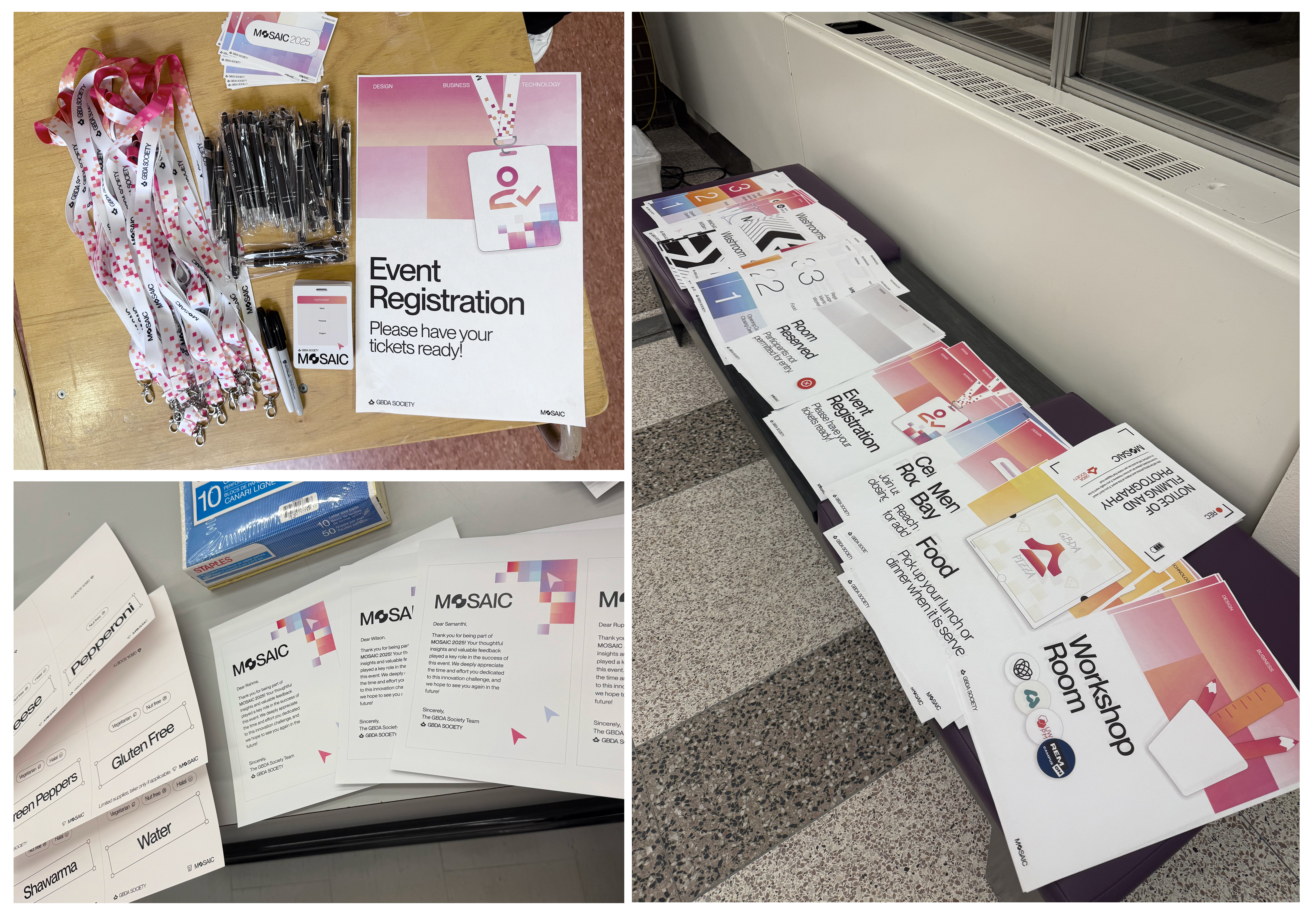
In the Winter term of 2025 at GBDA Soc, I had the cross-functional role of Brand Strategy Director where I worked closely with all departments of the team, especially the design team, Director of Operations, and President. Together with the design team, we launched a complete rebrand including a new logo, fonts, and social media presence. I then collaborated with the Director of Operations to strategically integrate our new brand across event materials such as pens, lanyards, certificates, badges, banners, and signage. By designing, producing, and promoting our brand identity, I helped foster a stronger sense of visual identity among GBDA students, gaining new skills and an incredible amount of hands-on experience.
Icon Design
2025
3 weeks
Figma, Adobe Illustrator
The first icon illustrates cable charging. The electrical outlet is represented with three outlet openings. The coiled blue line connected to the outlet represents a charging cable with green ends depicting the adapter and the connector, demonstrating the flow of energy from one end to another.
The second icon depicts wireless charging. The icon consists of a dark blue rectangular box with a green ring, symbolizing the charging platform. Along with the curvature of the green ring, shorter curved lines emit from it that demonstrate the wireless effect of the charging. A white lightning bolt is also placed in the middle of the rectangular box, along with three blue circles towards the bottom, to represent the energy and battery levels.
The third icon represents battery charging. It is illustrated through the borders of a dark blue rounded rectangle, blue blocks stacked inside of it, and protruding green bumps on the top and bottom to indicate the positive and negative terminals. The gradient of the blue blocks inside the rectangle indicates the dropping or raising of battery levels while a green plus sign in the top right reinforces the generation of energy.The sketches depict the real life objects of the three icons where I analyzed each of their features. Through this exercise, I was able to take note of small indicators, buttons, and patterns that I would include in the digital icons to make them easily identifiable.
Visual Identity
2025
3 weeks
Adobe Illustrator, Adobe Photoshop
The design revolves around the themes of authenticity and spontaneity and is represented through two key symbols: a bird and a book. The logo features a mockingbird composed of two elements: the wings, formed by a book with layered pages, and the body, represented by a cursive “s.” The top of the “s” forms the bird’s head while the curves mimic the body and stomach, and the tail symbolizes both a feathered tail and a bookmark. All components work together to express the concept of knowledge, freedom, and expression.
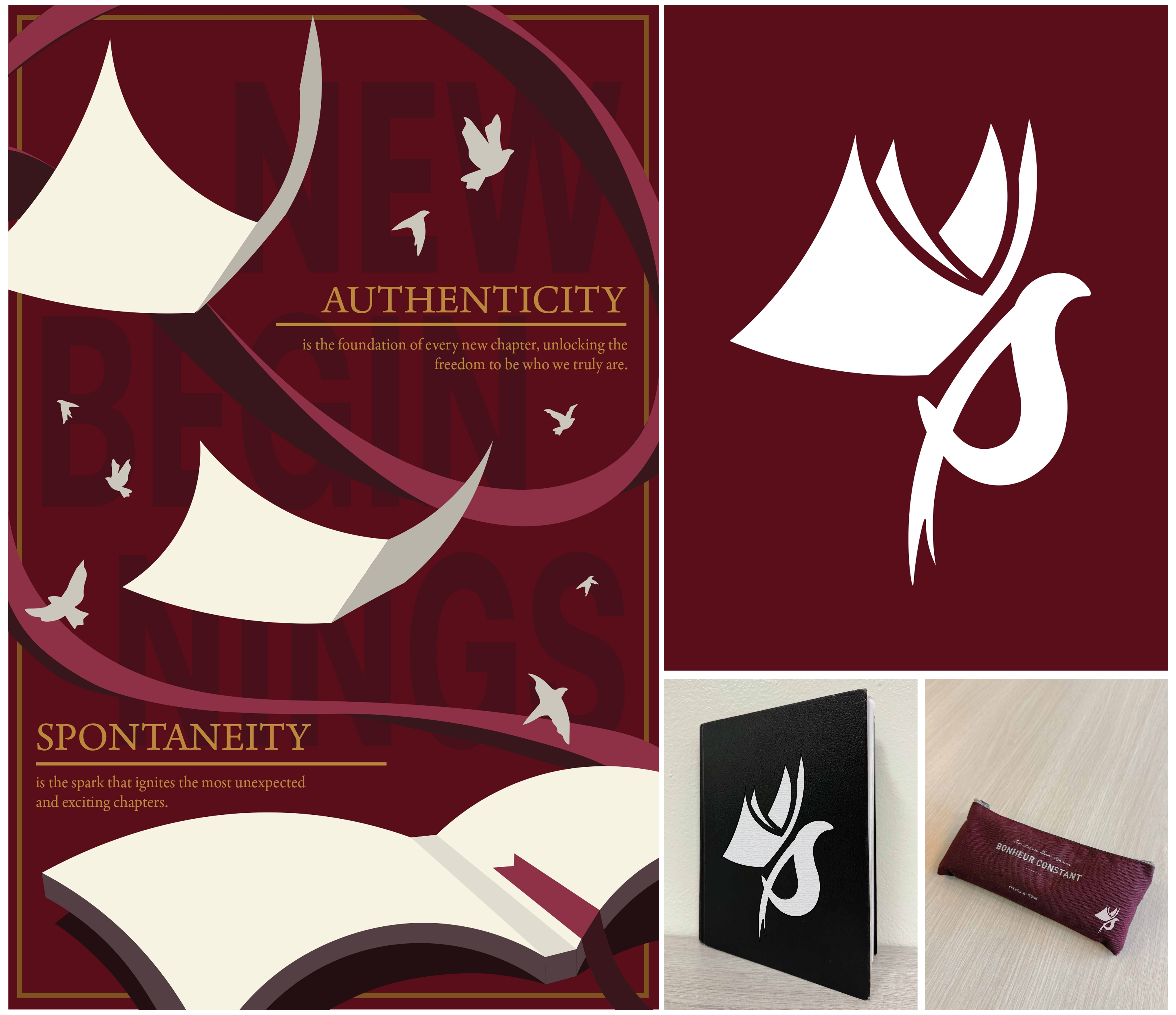
I decided to capture the personality of my client as someone spontaneous, impulsive, and authentic, through a bird because I felt that their energetic movements, curiosity, and enthusiasm parallelled nicely with my client and the concept of forming new beginnings and connections. Considering her passion for reading, the reason why I chose a mockingbird was due to my client’s interest in the Hunger Games as their story also dives into the symbolism of mockingbirds.
Magazine Design
2025
3 weeks
Adobe InDesign, Adobe Photoshop
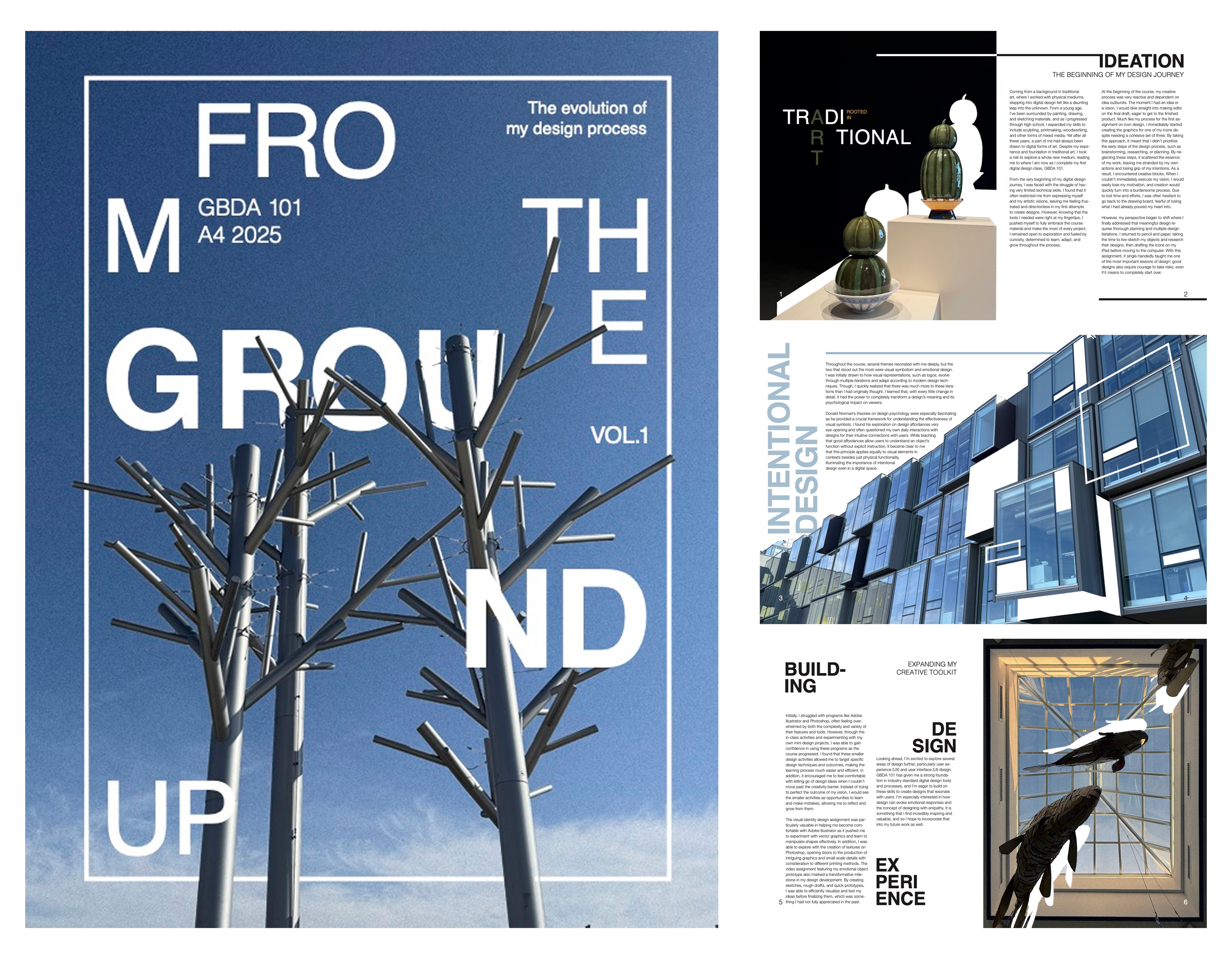
My favourite assignment during my first year at GBDA was the Magazine Design project where we had to take our own pictures and create a visual layout of a magazine. I used InDesign to create my project and filled the magazine with my design journey through the program. In addition to designing the magazine, we were required to print our magazines, fully encompassing the process of designing and producing. I thoroughly enjoyed this project and seeing the unique designs my peers created, it was a nice way to wrap up to our semester.
Photography
A Quiet Bloom — 2025
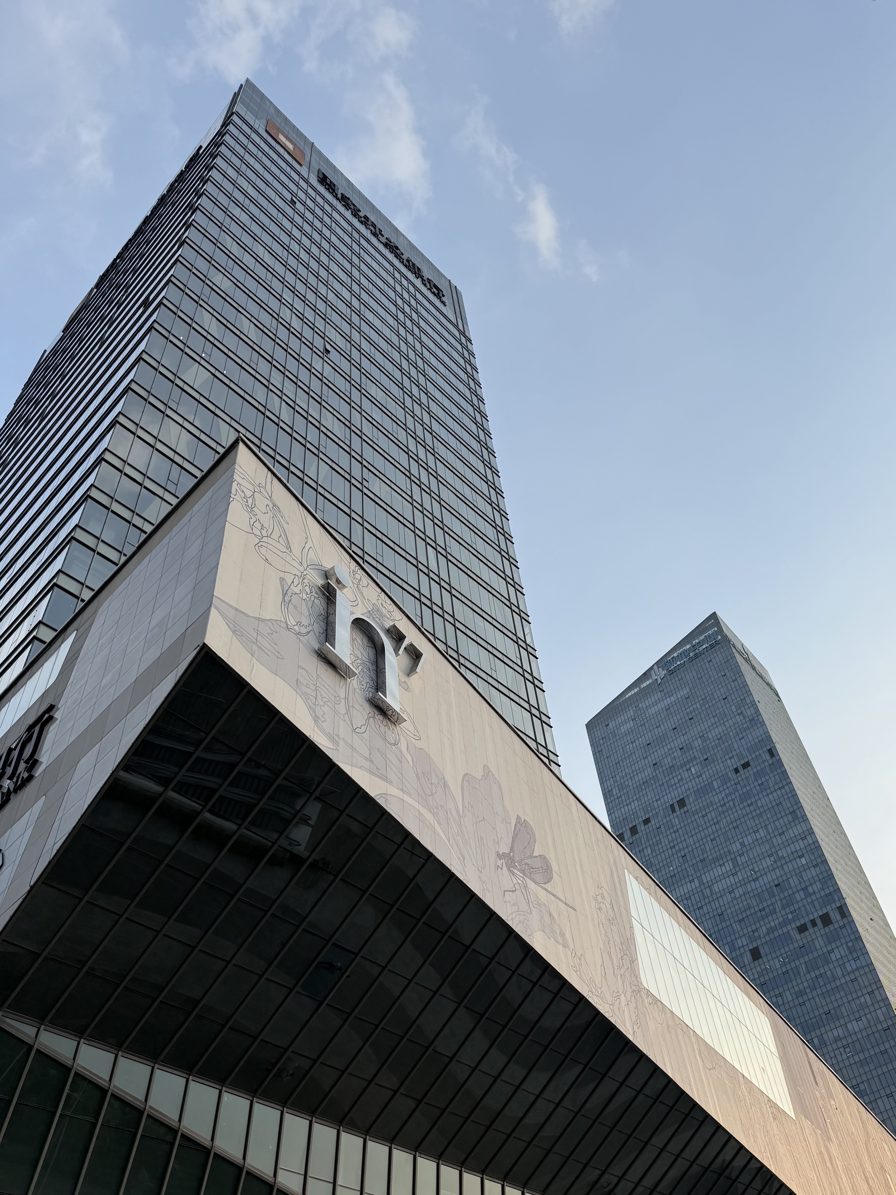
in77 — 2025
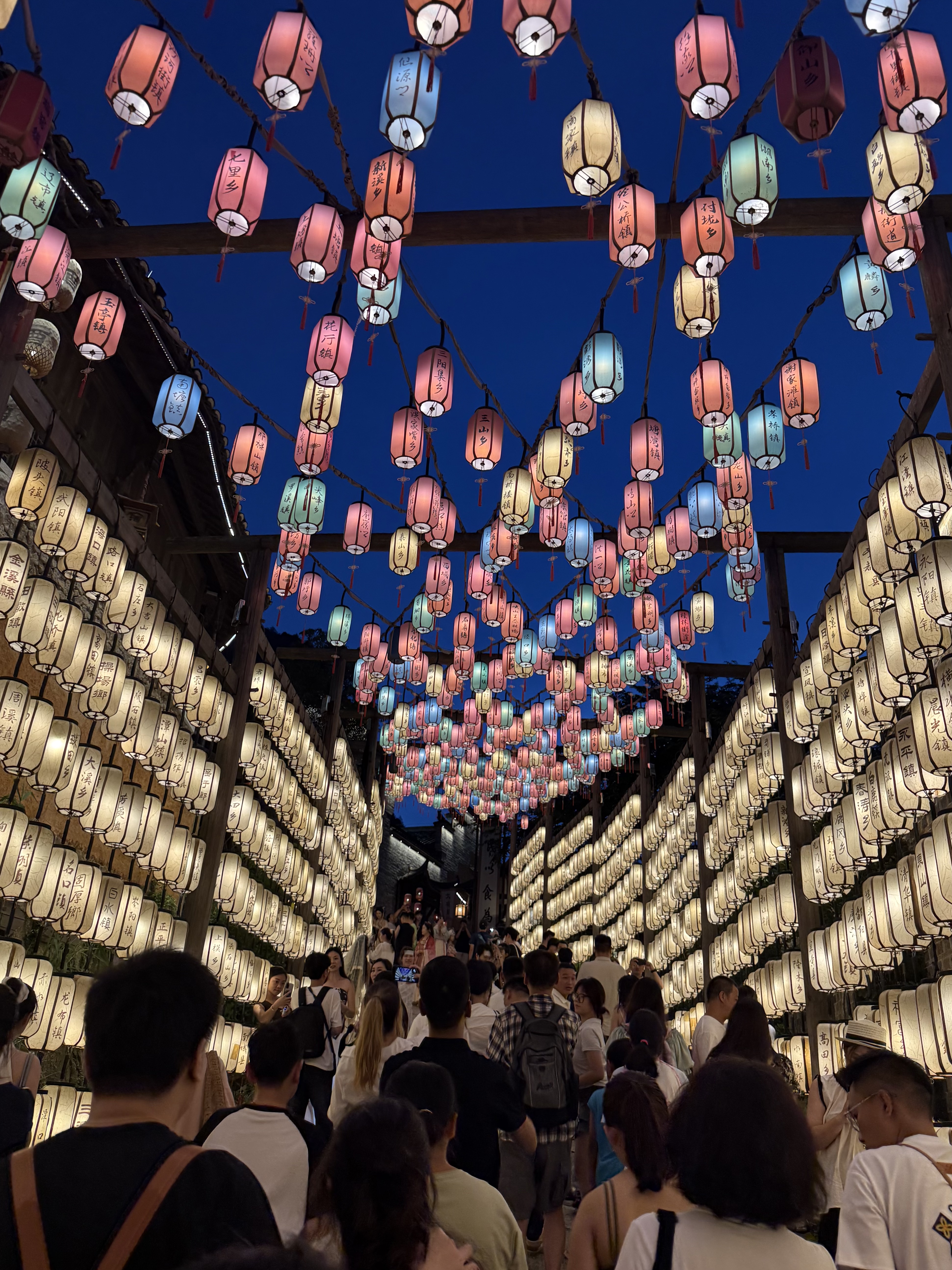
Guided — 2025
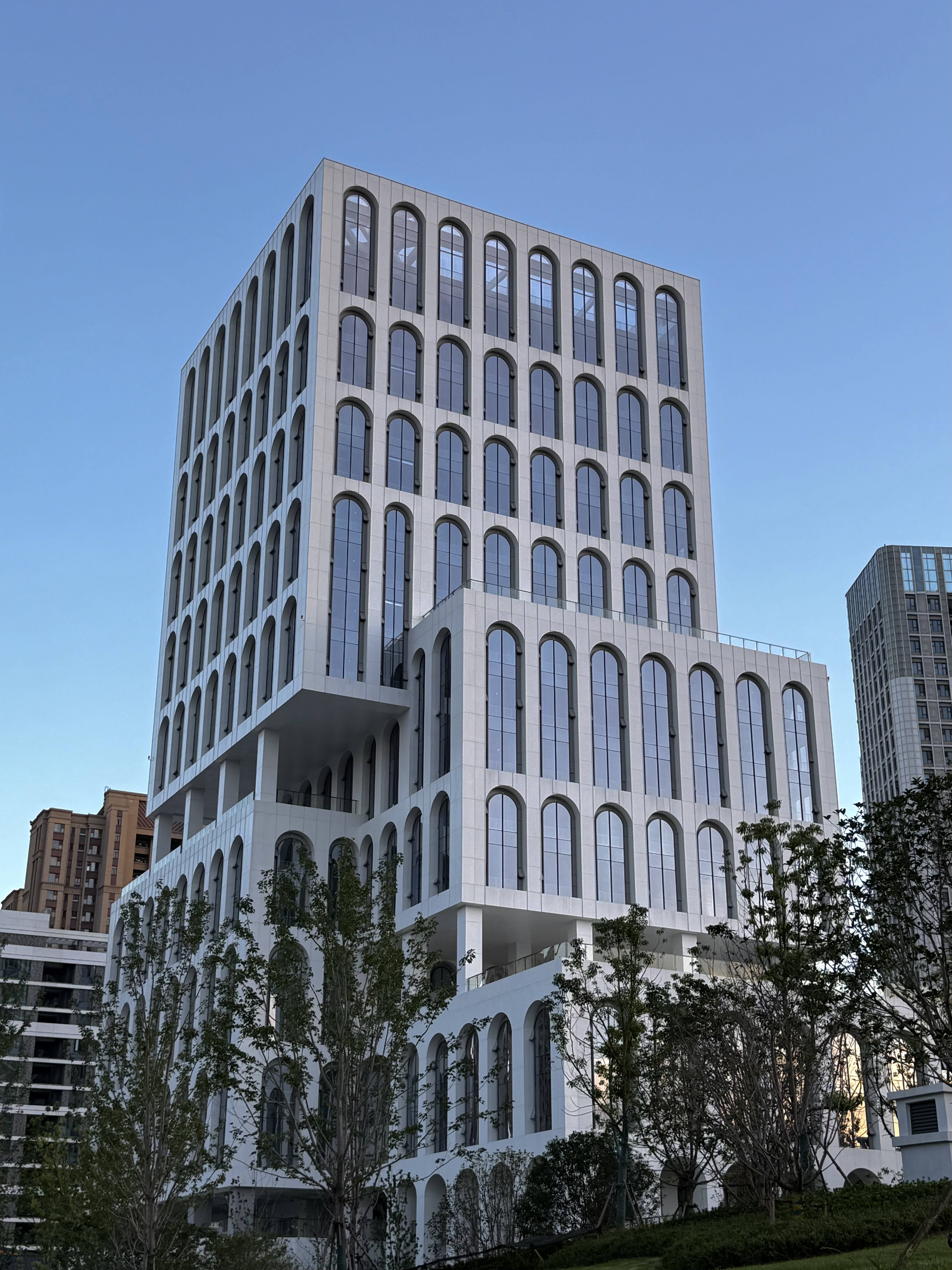
Arches — 2025
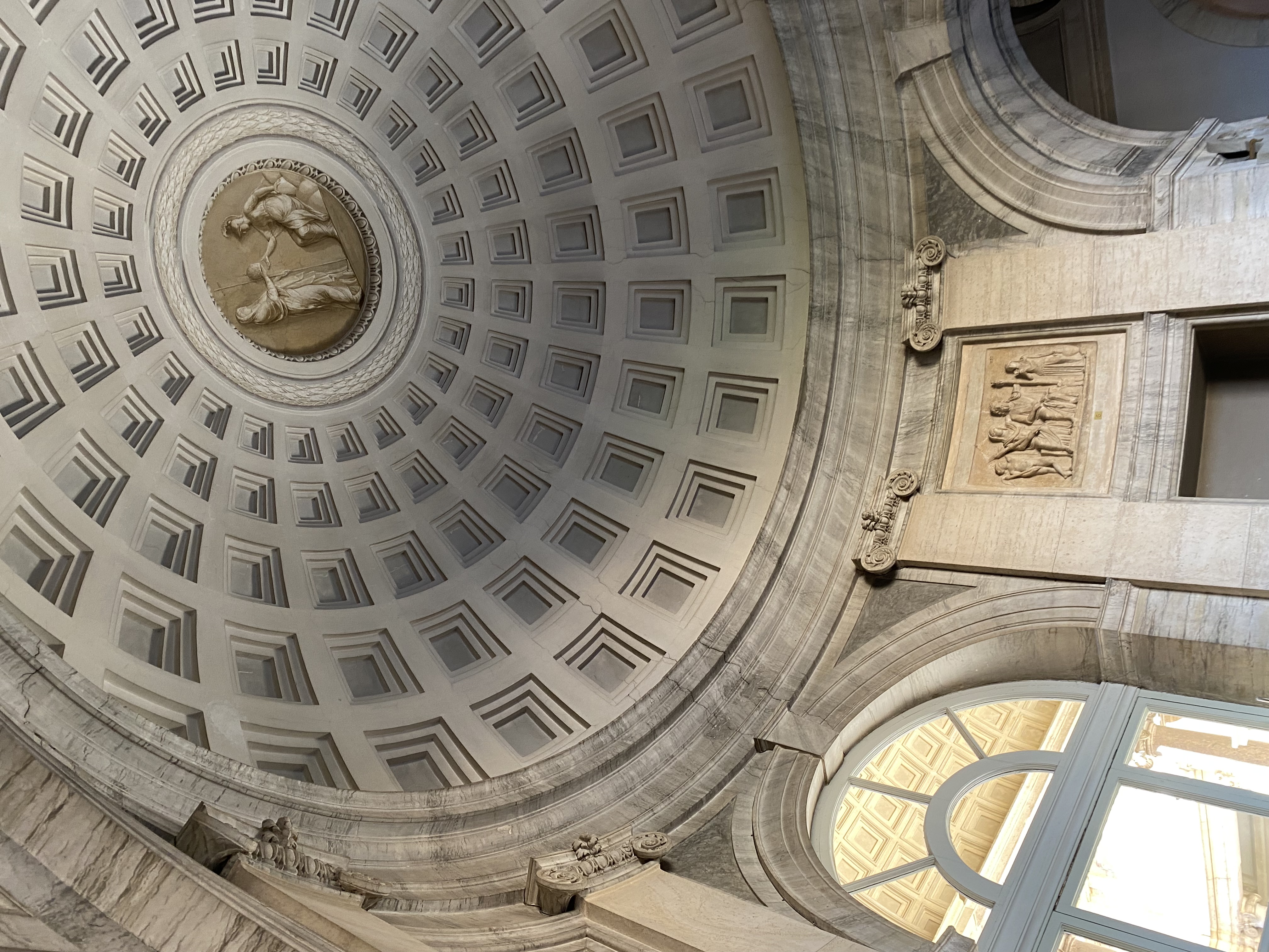
Art From Above — 2023

From The Ground Up — 2025
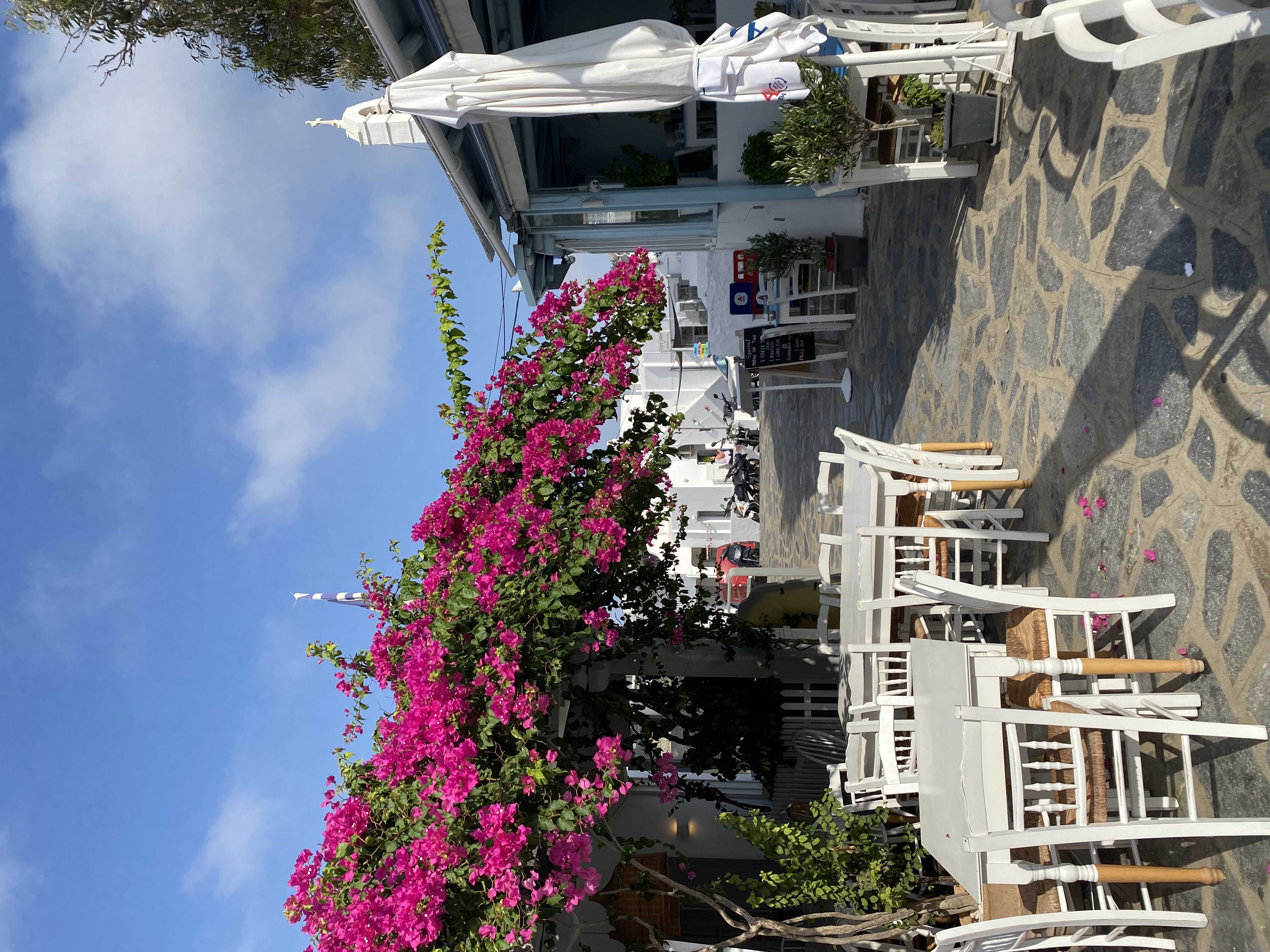
Bougainvillea — 2023
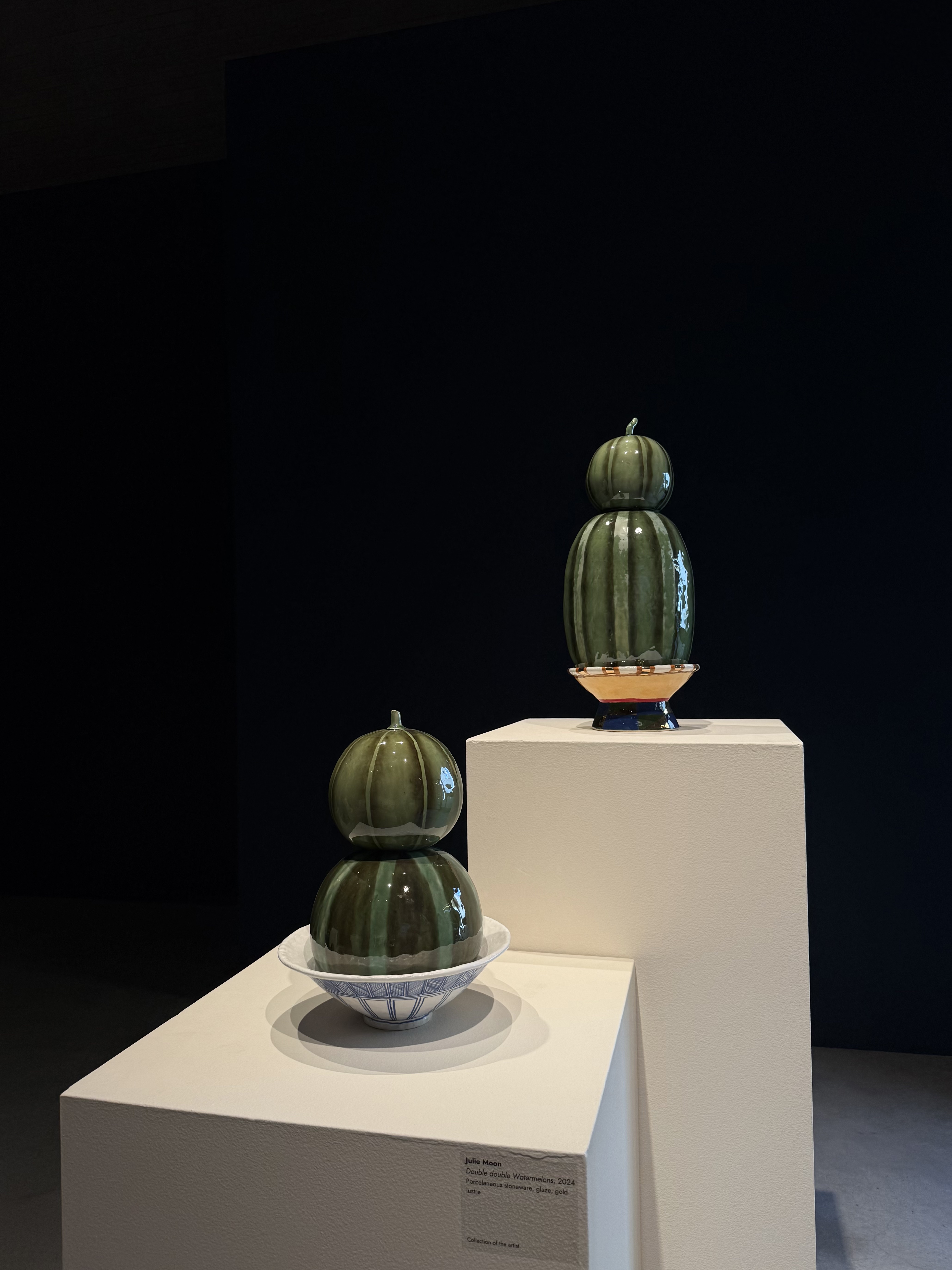
Melons — 2025
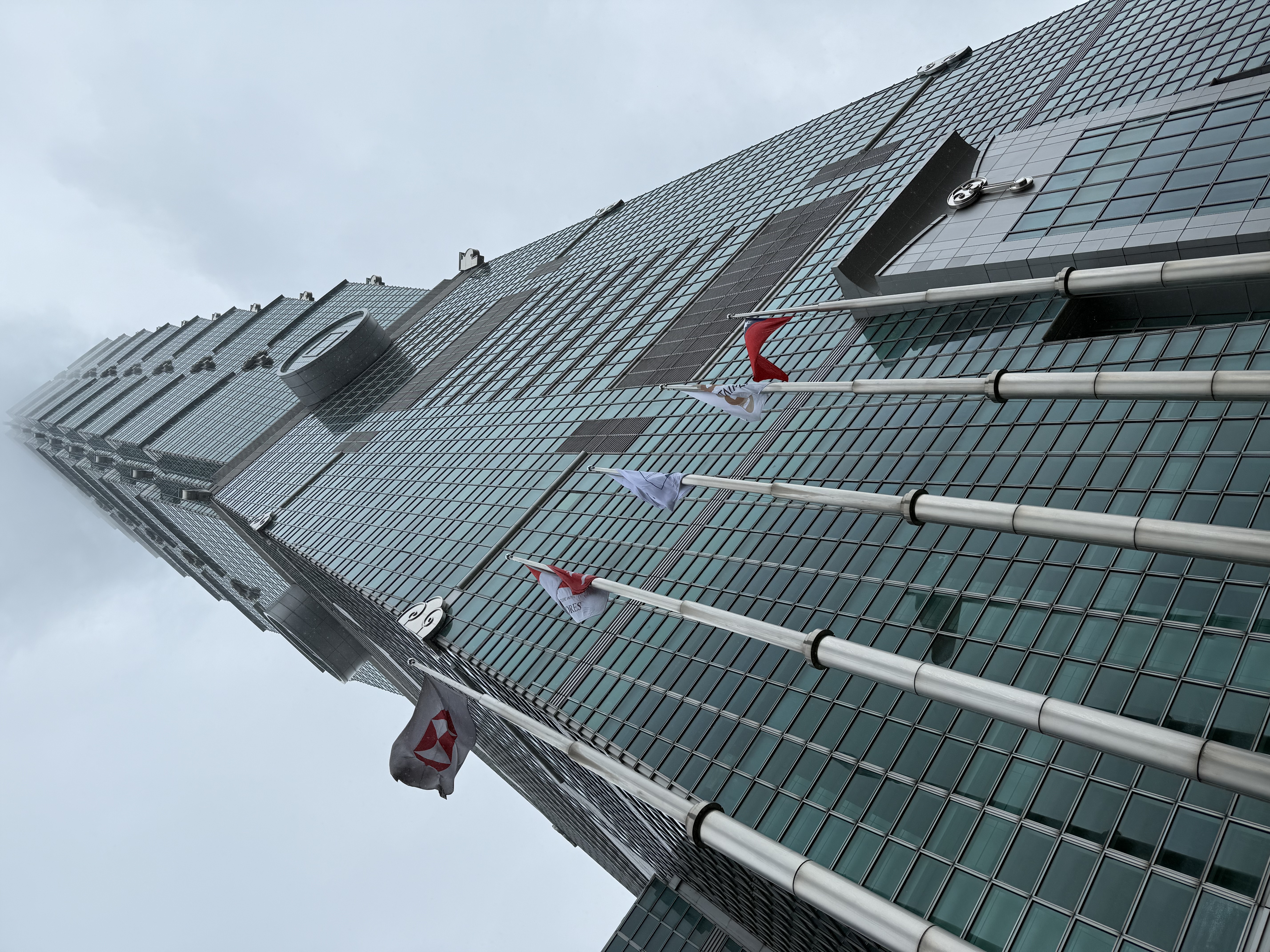
Taipei 101 — 2025
My ART IB Exhibition
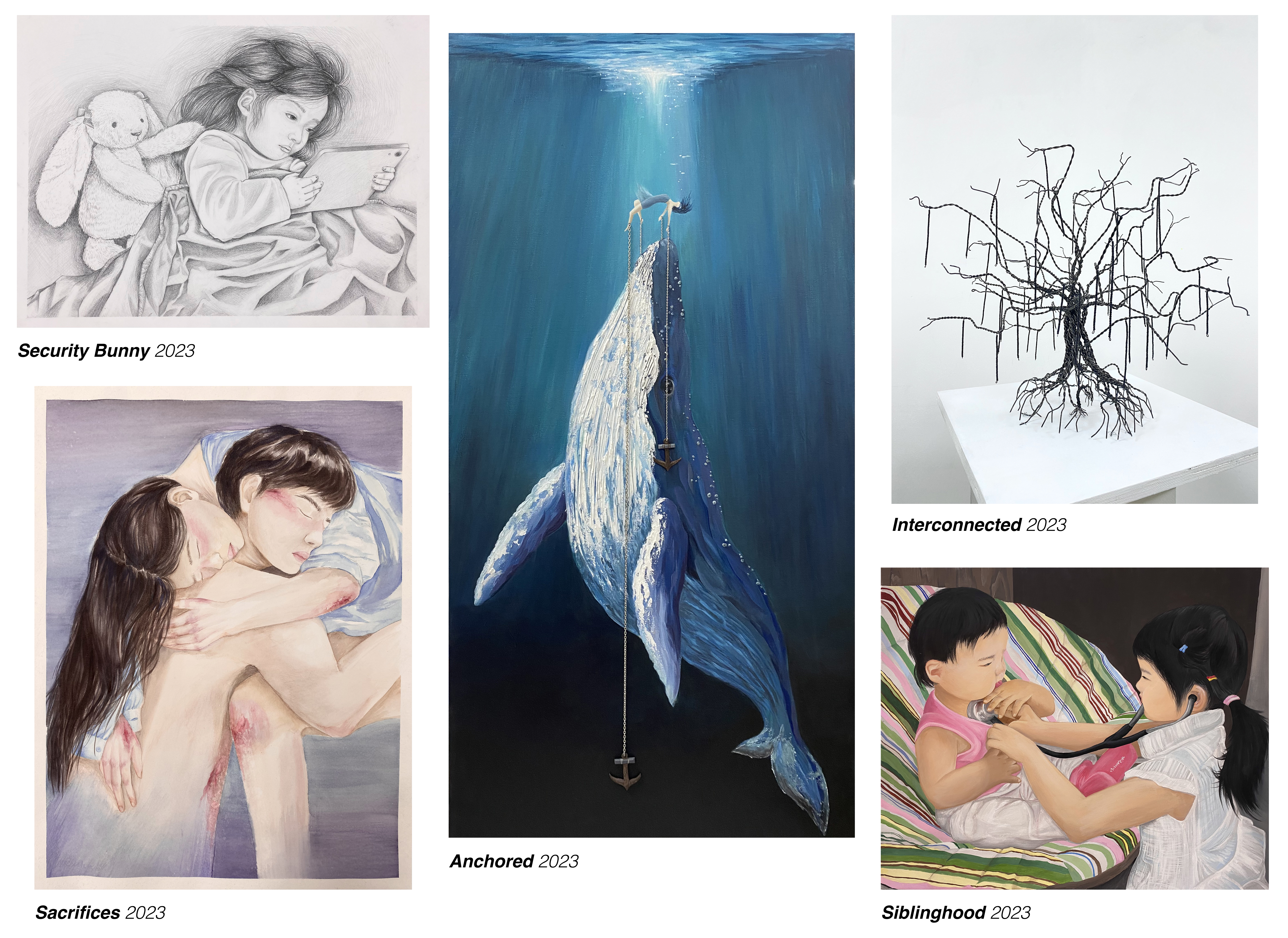
"As an artist, my intention is to bring viewers to their senses while inspiring them to connect with my art on an emotional and spiritual level. My aim is to help slow down the pace of humanity and encourage viewers to explore deeper meanings in life by capturing the small moments that usually go unnoticed. I hope for my viewers to stop and smell the roses, and to appreciate the people or environment around them. Though my artwork touches on sensitive subjects, I wish to bring a sense of peace to people that see my work and create a heartwarming effect on them by incorporating themes of family, childhood, nature and personal matters. I strive to make a positive influence on my viewers as they relate and reflect on their personal experiences to my artwork."
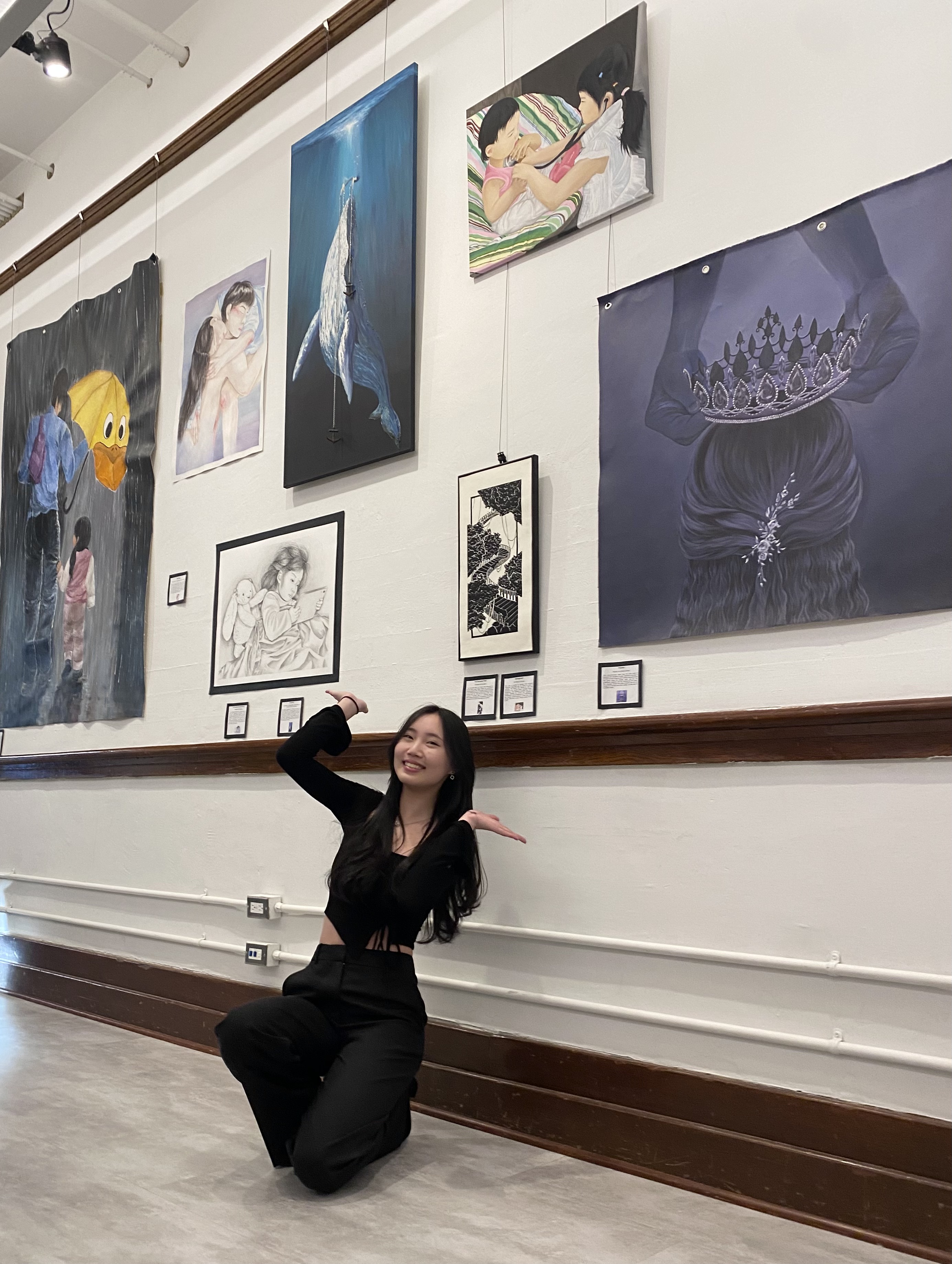
"The concepts explored in my pieces revolve around relationships and the emotions associated with them either between people, animals, objects, or the environment. My intention is to draw emotions from each situation and illustrate them, expressing them through my artwork and immersing the viewer into my perspective."
"Since my artwork tends to deal with mature themes of relations, my target audience leads toward the young adults, as I hope my artwork can encourage the audience to acknowledge her emotions and go from their experiences."
- Sections taken from Charlene's Curitorial Rational (2024)
